Navigation / Page Sections
Add navigation elements to your form by referring to the structural elements as there are pages, tabs and blocks.
The behaviour of these structural elements can be controlled by conditions:
they can be visible (default behaviour), invisible or disabled.
Therefore simply add the attribute data-hf-condition to the navigation elements and these are then handled according to the condition.
For more detailed information please refer to page "Conditions"
For individual styling apply custom styles to pages, tabs and blocks (for example overwrite the definition of text color) or úse the classes to access the structural element(s) by JavaScript.
HTML:
    <li data-hf-title="Input Controls" class="test-class-tab">
        <!-- Buttons -->
        <a href="#controls-block1"></a>
        <a href="#controls-block2" class="test-class-block"></a>

CSS:
    .test-class-tab{
        color: #257bc7;
    }

    .test-class-block{
        color: #c72525;
}
 Structure CSS Classes
Pages (First Level Navigation)
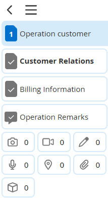
The first level navigation is positioned left-handed and refers to the form pages. The menu is implemented as HTML ordered list.
Each list entry must contain the attribute data-hf-title or data-hf-htmlTitle. These attributes define the label of the menu-entry.
data-hf-htmlTitle can be used to display HTML content as label. If both title attributes were specified data-hf-htmlTitle is displayed.
Further attributes are data-hf-condition and id. The attribute id is obligatory for expandable or repeating tabs or in combination with the attribute data-hf-condition.
Nevertheless it is best practice to define the attribute id.
For further and more general (programmatical) accessibility of structure elements you can add a class-attribute.

Page navigation
<!-- first level – pages -->
<ol>
  <li data-hf-title="Operation customer">...</li>

  <li data-hf-htmlTitle="<strong>Customer Relations</strong>">...</li>

  <li data-hf-title="Billing Information" data-hf-condition='{...}' id="billing" class="special-pdf">...</li>

  <li data-hf-title="Operation remarks" data-hf-type="evaluation">...</li>
</ol>
Define a page which is not included in the generated PDF by adding the attribute data-hf-type="evaluation".
Please consider this page to be the last one, so the generation of the corresponding PDF can be processed without gaps.
For more general purpose of styling your PDF use classes inside the list entries.
The counters for the required fields are generated automatically depending on the required fields.
The number of visible menu entries (e.g. pages) should be limited to seven due to display issues because otherwise scrolling in the left menu area can be necessary.
Next Page Button
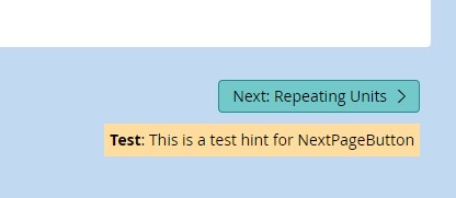
The next page button is positioned right-handed and refers to the next page.
It is configured by the attribute data-hf-next-page on a page section.
<!-- first level – pages -->
<ol>
    <li data-hf-title="Operation customer"
        data-hf-next-page>
        <!-- second level - tabs -->
        <ol>
            ...
        </ol>
    </li>
data-hf-next-page takes also an object for more complex configurations. A valid JSON string has to be used.
<!-- first level – pages -->
<ol>
    <li data-hf-title="Operation customer"
        data-hf-next-page='{
            "condition": "visible",
            "hint": "<strong>Test</strong>: This is a test hint for NextPageButton <img src=\"list.svg\" class=\"menu-icon-further\">"
        }'>
        <!-- second level - tabs -->
        <ol>
            ...
        </ol>
    </li>
| Attributes | Type | How to use | Description |
|---|---|---|---|
| condition | String | "condition": "visible" | Set the condition for the NextPageButton. visible navigates to the next visible page. fullfilled navigates to the next editable page. |
| hint | String | "hint": "<strong>Test</strong>: This is a test hint for NextPageButton" | Display a hint text below the actual button. HTML is allowed. Quots of HTML attributes have to be escaped. Images can only be used from form definition. |
| nextText | String | "nextText": "Next Page" | Display a custom prefix before next page title. |
| audioFeedback | String | "audioFeedback": true | Gives the uses an audio feedback when clicking on the next button. Default: false |

Next Page Button
Tabs (Second Level Navigation)
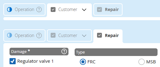
The second level navigation represents the tab menu inside one page. Define your tabs by inserting a new list inside the first navigation list:
<!-- first level – pages -->
<ol>
  <li data-hf-title="Operation customer">
    <!-- second level - tabs -->
    <ol>
      <li data-hf-title="Operation">...</li>
      <li data-hf-title="Customer">...</li>
      <li data-hf-htmlTitle="<strong>Repair</strong>">...</li>
    </ol>
  </li>
Tab navigation
As for the first level navigation define the label of the menu-entries by customizing the attribute data-hf-title.
If custom styles for tab labels are required data-hf-htmlTitle can be used to display HTML formatted content as label.
If both title attributes were specified data-hf-htmlTitle is displayed.
Tooltip
<!-- first level – pages -->
<ol>
  <li data-hf-title="Operation customer">
    <!-- second level - tabs -->
    <ol>
      <li data-hf-title="Operation"
        data-hf-tooltip="Operation description">...</li>
      <li data-hf-title="Customer">...</li>
      <li data-hf-title="Repair">...</li>
    </ol>
  </li>
Tab tooltip
It is possible to define a tooltip to describe the tab content more precisely. To activate this, the attribute data-hf-tooltip must be set.
Expandable Content
Provide the possibility to show or hide the content of a tab by adding the attributes data-hf-expandableDefault, data-hf-expandable and id. These attributes allow you to include or exclude additional content to the form and the generated PDF-file.
<li id="repairtab"
    data-hf-title="Repair"
    data-hf-expandable="true"
    data-hf-expandableDefault="closed"
    data-hf-condition='{...}'>
   <!-- third level - blocks -->
</li>

Expandale Tabs
The default status can be set to closed or expanded. In case of the default value closed the tab shows a ﹀-icon ("expand") on page load. The tab will be expanded by clicking the ﹀-icon to display the tab's content and add it to the PDF-file, opened tabs contain a ︿-icon ("close") to hide the input fields again and exclude the filled in content from the PDF.
| Attributes | Type | How to use | Description |
|---|---|---|---|
| id* | String | id="repairtab" | Set the ID of the tab. |
| data-hf-expandable* | Boolean | data-hf-expandable="true" | Set the attribute to true to enable opening and closing. |
| data-hf-expandableDefault | String | data-hf-expandableDefault="closed" | Set "closed" to hide the tab content or "expanded" to show the content. This attribute is optional. |
* These options are required
Repeatable Content
In some cases, it is useful to give the user the chance to repeat a set of controls within the form.
Provide this functionality by adding repeating units using data-hf-repeatable in the second level navigation.
For further information, please refer to page "Repeating Units".
Blocks (Third Level Navigation)
Assign all corresponding form blocks to the tabs by naming these blocks as text anchors inside the HTML-list entry in order of the wanted display of the blocks.
These blocks have to be implemented as template objects.
<!-- first level – pages -->
<ol>
    <li data-hf-title="Operation customer">
        <!-- second level - tabs -->
        <ol>
            <li data-hf-title="Operation">
                <!-- third level - blocks -->
                <a href="#operation-block1" data-hf-condition='{...}'></a>
                <a href="#operation-block2"></a>
            </li>
        ...
Includes
In case of multiple blocks differing only in a few elements (i.e. label-text, images etc.), it is possible to define the block once and create these multiple blocks inside the third level navigation.
For further information, please refer to page "Includes".
fullWidth Blocks
Define block as full width block.
    <li data-hf-title="Reperatur">
        <a href="#controls-fullWidth" data-hf-fullWidth="true"></a>
        <a href="#controls-block1"></a>
        <a href="#controls-block2"></a>
    </li>

fullWidth Blocks
CSS classes
Apply custom styles to pages, tabs and blocks (for example overwrite the definition of text color) or to access the structural element(s) by JavaScript.
HTML:
    <li data-hf-title="Input Controls "class="test-class-tab">
        <!-- Buttons -->
        <a href="#controls-block1"></a>
        <a href="#controls-block2" class="test-class-block"></a>

CSS:
    .test-class-tab{
        color: #257bc7;
    }

    .test-class-block{
        color: #c72525;
}

Structure CSS Classes