Form Blocks
The layout of the form is based on a CSS grid system to perform to the various displays and screen modes.
Please use only the predefined system!
Note
In HybridForms v8 the Bootstrap grid system is used to build layout blocks.

Grid options
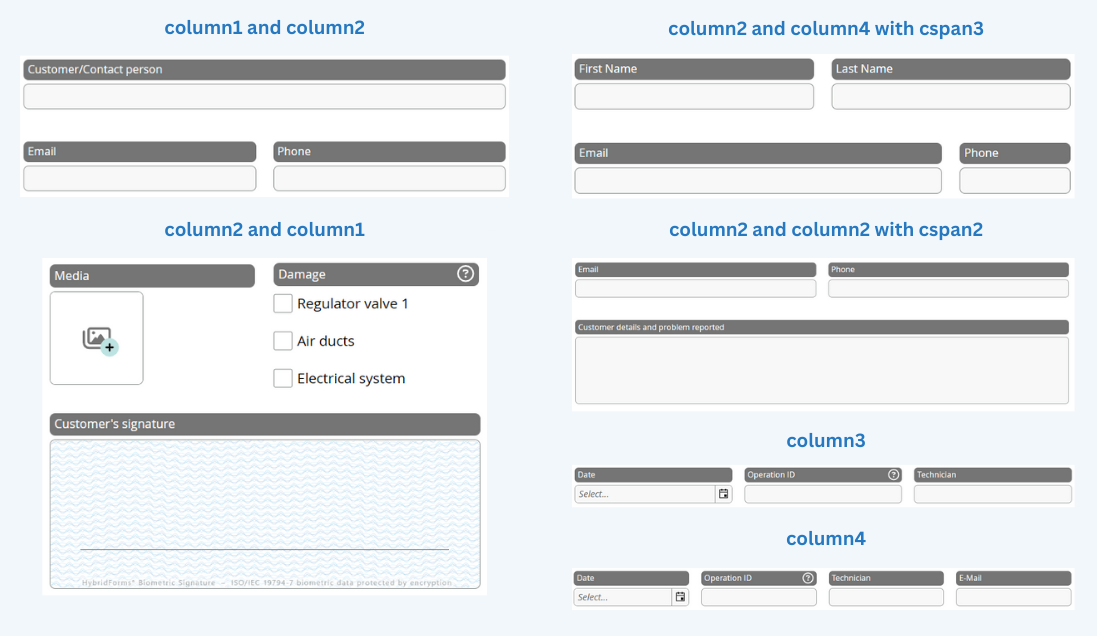
There are usually two blocks placed adjacent. Each block can contain several rows splitted in columns. The range is from one column up to 12 columns per block. The number of the columns define the maximum of columns a row can be split into.
The following example defines a grid within a block with the CSS classes "grid column3". This grid contains of one row (CSS class "r1") and, because of the column3 defined grid, it has three columns (CSS classes "c1", "c2", "c3"):
<div id="operation-block1" data-win-control="WinJS.Binding.Template">
    <div class="grid column3">
       <div class="r1 c1"> </div>
       <div class="r1 c2"> </div>
       <div class="r1 c3"> </div>
    </div>
</div>
| CSS class | How to use | Description |
|---|---|---|
| grid | class="grid … | The CSS class "grid" defines a grid-element with unlimited rows and a maximum of four columns. |
| column* | class="grid column1" | Number of columns in a row |
| c*auto | class="grid column2 c2auto" | The CSS class "c2auto" defines a column at the second position which is adjustable in width depending on the inside positioned element. Inside a CSS class column2 c1auto or/and c2auto are possible. |
| r* | class="r1 c2 cspan2" | The CSS classes "r*" defines the position of the row inside your grid. You can define 99 rows max. |
| c* | class="r1 c2 cspan2" | The CSS classes "c*" define the position of the column inside your row. Note please: You can only define as many columns as you defined in your grid (column3 ≠ c4)! |
| cspan* | class="r2 c1 cspan2" | Inside a CSS class column2 you can merge the two possible columns by applying the class cspan. The number indicates the number of columns to merge. |
| rl* | class="r1 c2 rl1 cl1" | Only v9 Grid: The CSS classes "rl*" defines the position of the row inside your grid on large screens (> 1109px). You can define 99 rows max. |
| cl* | class="r1 c2 rl1 cl1" | Only v9 Grid: The CSS classes "cl*" define the position of the column inside your row on large screens (> 1109px) Note please: You can only define as many columns as you defined in your grid (column3 ≠ c4)! |
| clspan* | class="r2 c1 rl1 cl1 clspan2" | Only v9 Grid: Inside a CSS class column2 you can merge the two possible columns by applying the class clspan on large screens (> 1109px). The number indicates the number of columns to merge. |