Template Objects
The form consists of several template objects. These template objects are defined as div-elements assigned the IDs headerTitleTemplate, titleTemplate, listTemplate and not less than two block objects with user-defined ID.
<div id="headerTitleTemplate" data-win-control="WinJS.Binding.Template">...</div>
<div id="titleTemplate" data-win-control="WinJS.Binding.Template">...</div>
<div id="listTemplate" data-win-control="WinJS.Binding.Template">...</div>
<div id="operation-block1" data-win-control="WinJS.Binding.Template">...</div>
<div id="operation-block2" data-win-control="WinJS.Binding.Template">...</div>
These div-elements must contain the attributes ID and data-win-control with the WinJS control WinJS.Binding.Template assigned to.
The blocks have to be referenced in your third level navigation or they will not be visible.
Referencing non-existing block template objects in your navigation will corrupt your HTML template and raises a fatal error.
Simply define empty template objects to avoid this error.
<div id="operation-block2" data-win-control="WinJS.Binding.Template"></div>
Header-Title-Template (Form Page Header)
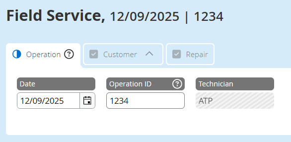
Since version 7.3.* it is possible to define the form page header inside the HTML template by adding the template object "headerTitleTemplate".
<!-- headerTitleTemplate - define the elements of the form item page header -->

<div id="headerTitleTemplate"
        data-win-control="WinJS.Binding.Template">
    <span data-win-control="HFWinJSCtrl.Spacer">
        <span data-win-control="HFWinJSCtrl.ObserveField"
                data-win-options="{ fieldId : 'tab1_datepicker' }"></span>
        <span class="spacer">|</span>
        <span data-win-bind="innerHTML: data.PageTitle"></span>
        (<span data-win-bind="innerHTML: data.FormTitle"></span>)
    </span>
</div>

Custom form item header
In case of no explicit definition inside your HTML template, the header shows the current page title and the form title:

Default form item header
Title-Template (Form Title)
The div titleTemplate defines the header section of your pages for the landscape and the portrait display orientation and contains the title of the form item.
<div id="titleTemplate" data-win-control="WinJS.Binding.Template">

Header section
The earlier defined titles inside your HTML file (data.VariableName) can be displayed by using the attribute data-win-bind to the HTML-tag using the binding property innerHTML.
<h1>
    <span data-win-bind="innerHTML: data.FormTitle"></span>
</h1>
The current stage of the form item can be displayed by using the stage.id and/or the stage.label, both defined in the form's stages.json.
<span data-win-bind="textContent: data.stage.id"></span>: <span data-win-bind="textContent: data.stage.label"></span>
Furthermore the data-win-controls HFWinJSCtrl.Spacer, HFWinJSCtrl.ObserveField and HFWinJSCtrl.DateFormater are used to process and format the data.
<h2 data-win-control="HFWinJSCtrl.Spacer">
    <span data-win-bind="textContent: listData.operation_date"
        data-win-control="HFWinJSCtrl.DateFormater"
        data-win-options="{ dateOnly : true }">
    </span>

    <span class="spacer">|</span>

    <span class="win-type-ellipsis"
        data-win-control="HFWinJSCtrl.ObserveField"
        data-win-options="{ fieldId : 'operation_id' }">
    </span>
</h2>
The HFWinJSCtrl.Spacer formats the output of the values inside this HTML element. If there are no values provided by the observed fields, this control removes unnecessary separators (e.g. "|"). Separators should be defined with a span-element and marked with the class spacer.
The HFWinJSCtrl.ObserveField control observes within the form defined controls and will be updated by any changes to these form elements. For instance, in the example above, when the "Operation ID" is filled in, the value of this field will be displayed and updated immediately in the title.
We recommend to use only these controls to be observed as follows:
| Control | Reference-ID | Observed value |
|---|---|---|
| TextField | <id> | input value |
| Checkbox | <id>_HFValue | value of the value attribute |
| RadioBox | <name>_HFValue | value of the value attribute |
| ComboBox | <id> | id of the selected value |
<id>_HFComboText | text-value of the selected value | |
| DropDownList | <id> | id of the selected value |
<id>_HFDropDownListText | text-value of the selected value | |
| SelectBox: | <id> | id of the selected value |
<id>_HFSelectText | text-value of the selected value | |
| TimePicker | <id> | selected time/content of the control in the predefined format |
| DatePicker | <id> | selected date/content of the control in the predefined format |
All other form elements have to be restricted to their text representation by using the data-binding method data-win-bind="textContent: ID-of-the-form-element".
The appendage listData to the ID requires the data-win-option list : true within the form control.
Additionally, there are options provided to the control HFWinJSCtrl.DateFormater helping you to format the value displayed.
List-Template (List Entry)
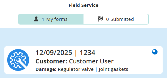
The div listTemplate defines the data of the list entry for the created form on the dashboard:

List data
Thumbnail image
<div id="listTemplate"
    data-win-control="WinJS.Binding.Template"
    data-win-options="{
        img: 'industry-listensymbol-repair-80x80.svg',
        showMainImage: true
    }">
    ...
</div>
The option showMainImage:true enables the display of a thumbnail of an attached picture as part of the list entry. Therefore the first picture of the form items picture gallery is used.
Data
Besides the form title, the stage information and the form controls, which can be defined inside your form template, the date of the latest modification of the form item is avaliable too:
<span data-win-bind="textContent: data.lastModified"
    data-win-control="HFWinJSCtrl.DateFormater"
    data-win-options="{ dateOnly: true  }"></span>
The item entry at the list page can contain three lines of data (div class="r1" ...). These three rows of data are styled inside by headings (h3 to h5) to emphasis the importance of the information provided at the list page.
If data of form controls (form fields) are used in the list template the data-win-option list of the corresponding form control must be set to true.
If you want that data connected with this control should be a sorting/filtering/grouping option on the listpage or should show up in admin ui listings also set the data-win-option list to true.
<div class="r1">
    <h3>
        <span data-win-control="HFWinJSCtrl.Spacer">
            <span data-win-bind="textContent: listData.operation_date"
                    data-win-control="HFWinJSCtrl.DateFormater"
                    data-win-options="{
                        dateFormat: 'dd/MM/yyyy',
                        dateOnly: true
                }"></span>
            <span class="spacer"> | </span>
            <span data-win-bind="textContent: listData.operation_time_start_HFTime"></span>
            <span class="spacer"> | </span>
            <span data-win-bind="textContent: listData.operation_id"></span>
        </span>
    </h3>
</div>

<div class="r2">
    <h4 data-win-control="HFWinJSCtrl.Spacer">
        Stage <span data-win-bind="textContent: data.stage.id"></span>: <span
            data-win-bind="textContent: data.stage.label"></span>
    </h4>
</div>

<div class="r3">
    <h5 data-win-control="HFWinJSCtrl.Spacer">
        <strong>Damage: </strong>
        <span data-win-control="HFWinJSCtrl.Spacer">
            <span data-win-bind="textContent: listData.schaden_fuellventil_gebrochen_HFValue"></span>
            <span class="spacer"> | </span>
            <span data-win-bind="textContent: listData.schaden_dichtungen_poroes_HFValue"></span>
            <span class="spacer"> | </span>
            <span data-win-bind="textContent: listData.schaden_druckzylinder_defekt_HFValue"></span>
            <span class="spacer"> | </span>
            <span data-win-bind="textContent: listData.schaden_rueckluftrohr_defekt_HFValue"></span>
            <span class="spacer"> | </span>
            <span data-win-bind="textContent: listData.schaden_elektronik_HFValue"></span>
        </span>
    </h5>
</div>
Use the control "HFWinJSCtrl.DateFormater" to display and format dates provided inside your form item.
Icons
Icons are displayed at the right side of the list entry. They are displayed by the system and can not be defined by the user.
The possible icons are:
- , , , , : Form progress. Calculated by filled required fields.
- : Form is approved.
- : Form is syncing or form has not synced to server yet.
- : Form is marked for deletion and will be removed at the next synchronization.
- : Form has unread feedback attached.
- : Form has status
Group. - : Form had sync conflict. This icon indicates the form as a copy of the original form.
- : Form has sync error. Clicking on this entry 5 times creates a copy of the form.
- : Extended read form. This icon indicates the form as an extended read form if the feature is active and the user is allowed to read.
Form Blocks
The layout of the form is based on a CSS grid system to perform to the various displays and screen modes.
Please use only the predefined system!

Grid options
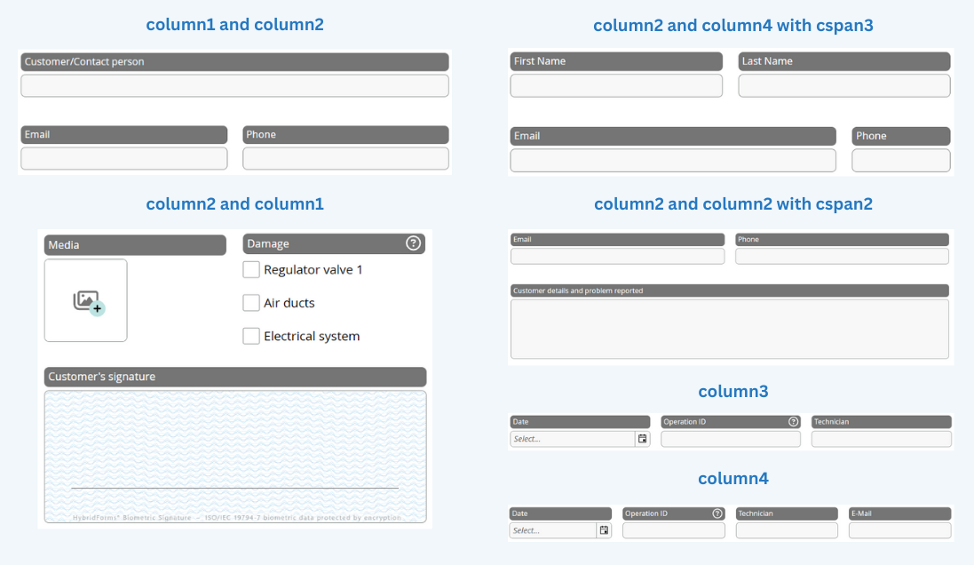
There are usually two blocks placed adjacent. Each block can contain several rows splitted in columns. The range is from one column up to four columns per block. The number of the columns define the maximum of columns a row can be split into.
The following example defines a grid within a block with the CSS classes "grid column3". This grid contains of one row (CSS class "r1") and, because of the column3 defined grid, it has three columns (CSS classes "c1", "c2", "c3"):
<div id="operation-block1" data-win-control="WinJS.Binding.Template">
    <div class="grid column3">
       <div class="r1 c1"> </div>
       <div class="r1 c2"> </div>
       <div class="r1 c3"> </div>
    </div>
</div>
| CSS class | How to use | Description |
|---|---|---|
| grid | class="grid … | The CSS class "grid" defines a grid-element with unlimited rows and a maximum of four columns. |
| column1 | class="grid column1" | "column1" limits the number of columns per row to one. |
| column2 | class="grid column2" | "column2" allows two columns per row. |
| column3 | class="grid column3" | "column3" allows three columns per row. |
| column4 | class="grid column4" | Four columns per row are possible. |
| c*auto | class="grid column2 c2auto" | The CSS class "c2auto" defines a column at the second position which is adjustable in width depending on the inside positioned image. Inside a CSS class column2 c1auto or/and c2auto are possible. |
| cspan... | class="r2 c1 cspan2" | Inside a CSS class column2 you can merge the two possible columns by applying the class cspan. The number indicates the number of columns to merge. |
| r1, r2, … | class="r1 c2 cspan2" | CSS class "r1" defines the position of the row inside your grid. You can define 99 rows max. |
| c1, c2, c3, c4 | class="r1 c2 cspan2" | The CSS classes "c1", "c2", "c3" and "c4" define the position of the column inside your row. Note please: You can only define as many columns as you defined in your grid (column3 ≠ c4)! |