Template Variables
Each form template has to contain the following variables declared inside the <form> - tag:
<!-- landscape title -->
<var data-hf-name="Title">Demo Form</var>

<!-- Provide info on the form template version -->
<var data-hf-name="info" ...></var>
<var data-hf-name="DataSource" ... ></var>

<var data-hf-name="FormDevCatalogIncludes" ... ></var>

<var data-hf-name="AppKioskMode" ... ></var>

<var data-hf-name="SketchTemplates" ... ></var>

<var data-hf-name="ListPageFavorites" ... ></var>

<var data-hf-name="ApproveButton" ...></var>

<var data-hf-name="DrawingColorPalette" ...></var>

<var data-hf-name="PdfSettings" ...></var>

<var data-hf-name="PictureCompression" ...></var>

<var data-hf-name="Initializer" ...></var>

<var data-hf-name="Reachout" ...></var>
Title(s)*
Define your form definition title displayed in the page header (list page and form edit mode).
<!--  title -->
<var data-hf-name="Title">FORM REPAIR</var>

Title - currently all displays
The definiton of the form definition title does not apply to the form item title unless you implement the variable in the title template.
<span data-win-bind="innerHTML: data.FormTitle"></span>
Version Info*
Provide form version information with the info-tag:
<form>
    ...
    <var data-hf-name="info"
        data-hf-version="2.1.0"
        data-hf-date="2019-10-29T11:40:02"
        data-hf-min-app-version="6.7.0"
        data-hf-min-server-version="6.6.4">
    </var>
    ...
</form>
Beginning with the HFSQL server version 7.0 the variable is required, any template upload without version info will fail.
The attributes data-hf-version and the data-hf-date are required, others are optional.
If a minimum app version (data-hf-min-app-version) is defined, this condition gets checked client-side. If the minimum version condition is not met, an error message is shown to the user.
The version information will be displayed at the settings page:
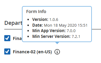
Version information
DataSource
Provides a catalog to the form which can be accessed through JavaScript API.
<var data-hf-name="DataSource"
data-hf-data-source-id="Staat"
data-hf-persistent="true">/api/catalogs/Staat?$select=Title,KatalogText&$orderby=KatalogText&$top=5000</var>
On form definiton subscription the catalog within the <var> tag gets attached to the form.
It can be accessed through Form-API method HybridForms.API.FormStorage.getDataSource by the name set at data-hf-data-source-id attribute.
FormDev DataSources
In the FormDev environment any catalog inside your HTML-file referenced by URL has to be substituted by a JSON-file. For example the previous declared DataSource "Staat" has to be present as "catalog.Staat.json" inside your folder to get the catalog in the FormDev environment.
For FormControls with data sources (ComboBoxes, DropDownLists) the JSON-files could be referenced in two ways:
- by the catalog name, eg:
catalag.<CatalogName>.json. TheCatalogNameis the name that you reference in theurlproperty of the control - by the id of the form control (deprecated), eg:
catalag.<FormControlID>.json
In case of multiple form definitions using one .templ-file it is necessary to provide these JSON-files in each definition folder.
By declaring the variable FormDevCatalogIncludes it is possible to reduce the number of files by storing the JSON-files in the template folder only.
<var data-hf-name="FormDevCatalogIncludes"
    data-hf-catalogs='[
        { "catalog": "../FormTempl.templ/catalog.CatalogName01.json" },
        { "catalog": "../FormTempl.templ/catalog.CatalogName02.json" }
    ]'>
</var>
In this example all form controls including the catalog urls /api/catalogs/CatalogName01/?$select=... and /api/catalogs/CatalogName02/?$select=... load the substitutional data source from the template folder.
App Kiosk Mode
The App Kiosk Mode is designed for providing the possibility to let unauthorized persons fill out forms in a secure way.
To enable the App Kiosk Mode the var tag has to be set within the form tag:
<var data-hf-name="AppKioskMode" ... ><var>
For more information on the App Kiosk Mode please refer to page "App Kiosk Mode".
Sketch Templates
Define background images for sketches inside your form definition.
Additional to the standard backgrounds of the HybridForms App (i.e. "blank" and "grid") provided by the feature "Sketches" you can add predefined background by declaring these background images inside your form definition.
<!--  background images for sketches -->
<var data-hf-name="SketchTemplates"
    data-hf-templates='[
        {"image": "sketchBackground01.jpg", "label": "Testtemplate"},
        {"image": "schaltplan.png", "label": "Schaltplan", "thumbnailImage": "schaltplan_tn.png"},
        {"image": "sketchBackground02.jpg", "label": "Platine"},
        {"image": "sketchBackground03.jpg", "label": "Nebula"}
    ]'
    data-hf-show-default-templates="true">
</var>
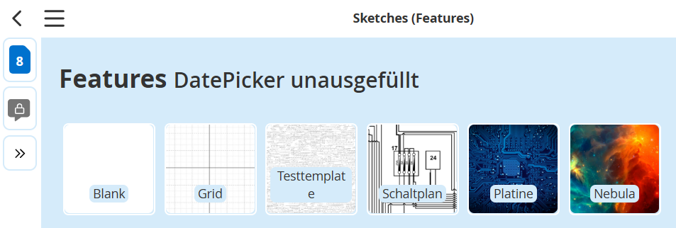
Sketch templates
The specific backgrounds are defined by listing the image name and the display label inside a JSON array.
Provide the images the same way as other images referenced inside your form template.
The JSON array consists of the key/value pairs "image", "label", "thumbnailImage", whereas image and label are obligatory data and the thumbnailImage is optional. If no "thumbnailImage" property is provided, the original image is presented on the sketch gallery. Dependend on the size of the image and the number of sketch templates this could lead to performance issues. If you provide high resolution sketch templates always provide a thumbnail image.
The variables option data-hf-show-default-templates can be set to true offering the HybridForms App default sketch backgrounds or to false disabling these.
ListPage Favorites
By using this variable you can predefine the display of listings of forms to enhance usability. You can define so called "form favorites" effective for the form definition.
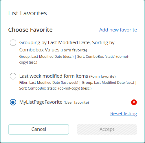
ListPage Favorites
Each user has the possibility to define and save personal "user favorites" based on his own assembly of sort, filter and group criterias.
The JSON array entries can contain the key/value pairs "label", "sorting", "grouping", "filter" and "default" whereas only the key/value pair "label" is obligatory.
Defining a list page favorite with only a label will set the layout of the list page to the HybridForms App default settings. These are "grouping" none, "sorting" - ascending by date "last modified" and "filter" none.
The values of "sorting", "grouping", "filter" are nested JSON objects and have to contain the key/value pairs "id" and "type", the setting "filter" additional the key/value pair "filterValue". The key/value pair "direction" is optional.
<var data-hf-name="ListPageFavorites"
    data-hf-favorites='[
        {
            "label": "Group by Date, Sort by Combobox",
            "sorting": {"id":"tab1_combobox_statisch", "direction": "ascending", "type": "text"},
            "grouping":{"id":"lastModified", "direction": "ascending", "type":"date"},
            "default": false
        },
        {
            "label": "Forms edited last week",
            "grouping":{"id":"lastModified", "direction": "ascending", "type":"date"},
            "sorting": {"id":"tab1_combobox_statisch", "direction": "descending", "type": "text"},
            "filter": {"id": "lastModified", "label":"Last Modified", "type": "date", "filterValue":"lastWeek"},
            "default": false
        } ,
        {
            "label": "Forms in Stage 1",
            "filter": {"id": "stage", "label":"Stage 1", "type": "stage", "filterValue":[{"value": "ST1", "text": "Stage ST1"}]},
            "default": false
        } ,
        {
            "label": "Checkbox activated",
            "filter": {"id": "checkboxh1", "label":"Checked", "type": "checkbox", "filterValue": true},
            "default": false
        }
    ]'>
</var>
| key | value | How to use | Description |
|---|---|---|---|
| label* | String | Provide a name for your predefined listing | |
| grouping | Object | grouping: { ... } | Define the desired grouping options |
| sorting | Object | sorting: { ... } | Define the desired sorting options |
| filter | Object | filter: { ... }; | Define the desired filter options |
| default | Boolean | "default": false | Specify the default behavior of the favorite setting - active on load of the list page (true) or not (false) |
* These options are required.
The three possibilities to structure the list are are influencing each other: Filtering the list will restrict the display to the form items matching the predefined filter criteria. These reduced list is grouped according to the grouping criteria and the groups are sorted according to any defined sort criteria.
Nested JSON Object 'grouping'
| key | value | How to use | Description |
|---|---|---|---|
| id* | String | "id":"tab1_combobox_statisch" | The ID of the form control used for grouping/sorting/filtering |
| direction | String | "direction":"ascending" "direction":"descending" | Define the sorting criteria of the groups, i.e. ascending or descending. |
| type* | String | "type":"date" | Define the data type of the form control, possible values are boolean,text, number, date, time , select, radio |
* These options are required.
Nested JSON Object 'sorting'
| key | value | How to use | Description |
|---|---|---|---|
| id* | String | "id":"tab1_combobox_statisch" | The ID of the form control used for sorting |
| direction | String | "direction":"ascending" "direction":"descending" | Define the sorting criteria i.e. ascending or descending. |
| type* | String | "type":"date" | Define the data type of the form control, possible values are boolean, text, number, date, time , select, radio |
* These options are required.
Nested JSON Object 'filter'
| key | value | How to use | Description |
|---|---|---|---|
| id* | String | "id": "lastModified" "id": "formDate" | Besides the IDs of form controls of your template there are two default values possible: lastModified represents the date of the latest saved change and formDate the date of the form item creation. |
| direction | String | "direction":"ascending" "direction":"descending" | Define the sorting criteria i.e. ascending or descending. |
| type* | String | "type":"date" | Define the data type of the form control, possible values are boolean, text, number, date, time, select, radio |
| filterValue* | String | "filterValue":"lastWeek" | Define the value of the filter i.e. the search criteria the form control's value has to match to. |
| JSON Object | "filterValue":[{"value": "ST1", "text": "Stage ST1"}] | Define the value of the filter i.e. the search criteria the form control's value has to match to. | |
| Boolean | "filterValue": true | Define the value of the filter i.e. the search criteria the form control's value has to match to. |
* These options are required.
filterValue ('JSON Object')
This filterValue type is applicable for the type "stage". The JSON object consists of the key-value pair declared inside your stages.json: The key represents the the custom name of your stages object ("value": "ST1") and the value is the label defined in the object ("text": "Stage ST1").
"ST1": {
	"first": true,
    "label": "Stage ST1",
}
filterValue ('String')
This filterValue is applicable to all text-based values of the controls "ComboBox", "Datepicker", "NumericField", "SelectBox", "TextField" and "TimePicker".
Note: The filterValue for the
"type":"date"must be one of these predefined values ('today', 'last3days', 'currentWeek', 'currentMonth', 'lastMonth','currentYear' and 'lastYear') of time periods.
filterValue ('Boolean')
This filterValue is applicable to the controls "CheckBox" and "RadioBox" and must not be quoted.
Customized Approve Button
Customize the label, tooltipp and pop-up dialog of the Approve button to your requirements.
<var data-hf-name="ApproveButton"
    data-hf-label="Custom Approve Button: {{field_id}}"
    data-hf-dialog-message="The custom text of the dialog containing value: {{field_id}}"
    data-hf-dialog-title="The custom title of the dialog">
</var>
The placeholder {{field_id}} can be used to display list data values.
The attribute data-hf-label is obligatory and is used as button label and tooltip text. The attributes data-hf-dialog-message and data-hf-dialog-title are optional and set the Approve dialog title and information text.
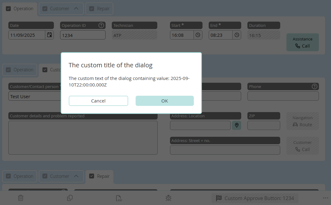
Customized Approve Button
Customized Color Palette
Use this variable to predefine the color palette for the drawing feature.
The definition affects all drawing possibilities (inside the features and form controls).
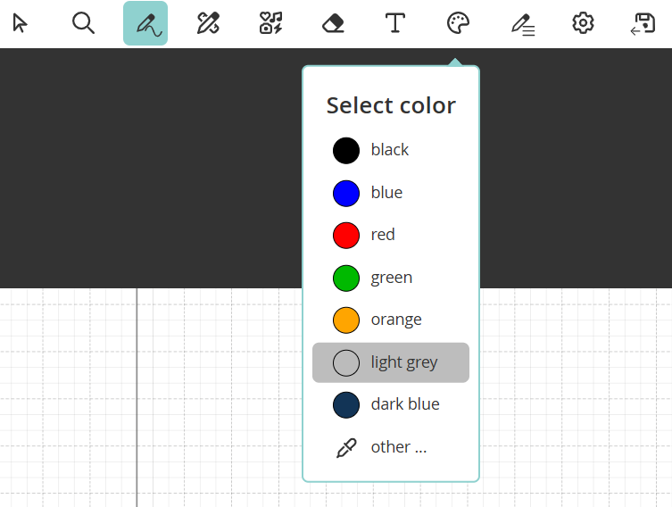
Custom Color Palette
The JSON array entries contain the key/value pairs "color", "text" and "default" whereas key/value pair "color" and "text" are obligatory.
The variables option data-hf-extend-default-colors has to be a boolean value:
trueextends the HybridForms App default color palette.- If new default color is set in FormDefintion the HybridForms App default color will be overwritten.
falseoverwrites the HybridForms App default color palette.- If not set the HybridForms App default color palette will be overwritten.
<var data-hf-name="DrawingColorPalette"
    data-hf-colors='[
        { "color": "#000000", "text": "black" },
        { "color": "#0000ff", "text": "blue" },
        { "color": "#ff0000", "text": "red", "default": true },
        { "color": "#00b900", "text": "green" },
        { "color": "#ffa500", "text": "orange" }
    ]'
    data-hf-extend-default-colors="false">
</var>
| key | value | How to use | Description |
|---|---|---|---|
| color* | String | "color": "#32a952" | Provide a value for your color palette listing. The value has to be a legal Hexadecimal CSS color value. |
| text* | String | "text": "green" | Provide a name for your color palette listing. |
| default | Boolean | "default": true | Specify the default color of the color palette. If no default value is specified the first value of the list will set as default. |
* These options are required.
PDF Settings
Use this variable to control the PDF output.
For more information on the possibilities please refer to page "Create PDF"
Picture Compression
Use this variable to set picture compression for all uploaded images inside this form.
The definition affects all image uploads (inside the features and form controls).
<var data-hf-name="PictureCompression"
    data-hf-compression='{
        "type": "compress",
        "options": {
            "format": "jpg",
            "jpgQuality": 0.1,
            "maxDimension": 1400
        }
    }'>
</var>
The value of the data-hf-compression must be a JSON string.
The typescript representation of the condition object is defined below:
interface IPictureCompression {
    type: 'original' | 'compress';
    options: IPictureCompressionOptions;
}

interface IPictureCompressionOptions {
    format: 'jpg' | 'png';
    jpgQuality: number;
    maxDimension: number;
}
| key | value | How to use | Description |
|---|---|---|---|
| type* | String | "type": "compress" | Enable or disable picture compression by setting type to compress or original. |
| options | Object | "options": { ... } | Define the compression depth. |
* These options are required.
Compression options
| key | value | How to use | Description |
|---|---|---|---|
| format* | String | "format": "jpg" | Set the image format of the output file. png or jpg are supported. Default value is jpg. |
| jpgQuality* | Number | "jpgQuality": 0.1 | Set the jpg image quality to compress the output file. Values between 0.1 and 1 are supported. Default value is 0.6. |
| maxDimension | Number | "maxDimension": 1400 | Set the maximum dimension of the output file. Images are only reduced in size. |
* These options are required.
Initializer
Use this variable to set initializer functions executing on form rendered and view rendered (PDF). They can be used to execute a custom amount of functions on form rendered.
- HTML
- TypeScript
<var data-hf-name="Initializer"
    data-hf-rendered="HFFormdefinition.Namespace.onRendered"
    data-hf-view-rendered="HFFormdefinition.Namespace.onViewRendered"></var>
export function onRendered() {
    console.log('************** onRendered **************');
    HFFormdefinition.Namespace.doSomethingOnRendered();
}

export function onViewRendered() {
    console.log('************** onViewRendered **************');
    HFFormdefinition.Namespace.doSomethingOnViewRendered();
}
Rendered function is required. This mechanisum replaces Initializr custom control.
Reachout
HybridForms® ReachOut is a module for anonymous external/internet use of forms.
<var data-hf-name="Reachout"
    data-hf-maxtime="60"
    data-hf-mintime="5"
    data-hf-show-preview="false"
    data-hf-show-pdf="S1,S3"
    data-hf-strings='{
        "PDFDownloadButton": "Download form as a PDF",
        "RemainingTime": "Remaining Time"
    }'>
</var>
| key | value | How to use | Description |
|---|---|---|---|
| data-hf-maxtime | Number | "data-hf-maxtime="60" | Set the maximum time for customers to fill out Reachout forms. Default is 90 minutes. |
| data-hf-mintime | Number | "data-hf-mintime="5" | Set the minimum time for customers to fill out Reachout forms. Default is 1 minute. |
| data-hf-show-preview | Boolean | String | "data-hf-show-preview": "S1,S4" | Configure if or on what stage the preview should be displayed to the user. Provide a boolean or a comma seperated list of stage keys. |
| data-hf-show-pdf | Boolean | String | "data-hf-show-pdf": "false" | Configure if or on what stage the pdf should be displayed to the user after sending the form. Provide a boolean or a comma seperated list of stage keys. |
| data-hf-strings | Object | "data-hf-strings": '{ ... }' | Set the minimum time for customers to fill out Reachout forms. Default is 1 minute. |
Reachout strings
<var data-hf-name="Reachout"
  data-hf-strings='{
      "PDFDownloadButton": "Download form as a PDF",
      "RemainingTime": "Remaining Time",
      "RemainingTimeIsUp": "Unfortunately, you exceeded the maximum processing time of {0} minutes - the process was therefore canceled. If necessary, please start a new form.",
      "SubmissionError": "Your form could not be submitted.",
      "SubmissionSuccessMsg": "Your form was accepted with the process number #{0}. You will now receive a PDF version for viewing or downloading.",
      "SubmissionSuccessTitle": "Form submitted successfully",
      "SubmissionSuccessPrimaryBtn": "Continue to the PDF",
      "SubmissionSuccessHtml": "<strong>Your form has been submitted successfully.</strong> Process number #{0}.",
      "PreviewMsgHtml": "<strong> Preview: </strong> This is not yet a confirmation!",
      "PreviewLoadingMsg": "The preview of the form is prepared. Please be patient for a few seconds.",
      "ClosePreviewBtn": "Back/Edit",
      "PreviewBtn": "Go to Preview",
      "SendBtn": "Send",
      "CouldNotGetFormData": "The requested form data is currently not available. Please try again later.",
      "UploadingFormMsg": "Form is being uploaded",
      "TransmissionError": "A tranmission error has occurred. Please try again to upload the form.",
      "SaveError": "We are sorry. There has been an error.",
      "NotFilledOut": "You have not yet entered all mandatory fields",
      "ConfirmSendFormTitle": "Send form?",
      "ConfirmSendFormMsg": "Do you want to submit the form? No more changes can be made.",
      "ConfirmSendFormBtnLabel": "Send"
  }'>
</var>
| key | Default en | Default de | Variables | Usage |
|---|---|---|---|---|
| PDFDownloadButton | Download form as a PDF | Formular als PDF herunterladen. | - | Label of PDF download button after sending the form. |
| RemainingTime | Remaining time | Verbleibende Zeit | - | Label of "Remaining time" button in the bottom toolbar. |
| RemainingTimeIsUp | Unfortunately, you exceeded the maximum processing time of 0 minutes - the process was therefore canceled. If necessary, please start a new form. | Sie haben den maximalen Bearbeitungszeit von 60 Minuten leider überschritten – der Prozess wurde daher abgebrochen. Bitte beginnen Sie bei Bedarf ein neues Formular. | 0 - time in minutes | Label in the bottom toolbar of the form after fill out time is up. |
| SubmissionError | Your form could not be submitted. | Ihr Formular konnte nicht übermittelt werden. | - | Error message if submission failed. |
| SubmissionSuccessMsg | Your form was accepted with the process number #0. You will now receive a PDF version for viewing or downloading. | Ihr Formular wurde mit der Prozessnummer #0 übernommen. Sie erhalten nun eine PDF-Version zur Ansicht bzw. zum Download. | 0 - Guid of process number | Info Text in Dialog after successfull submission. |
| SubmissionSuccessTitle | Form submitted successfully | Formular erfolgreich übermittelt | - | Title of dialog after successfull submission. |
| SubmissionSuccessPrimaryBtn | Continue to the PDF | Weiter zum PDF | - | Button label for dialog after successfull submission. |
| SubmissionSuccessHtml | Your form has been submitted successfully. Process number #0. | Ihr Formular wurde erfolgreich übermittelt. Prozessnummer #0. | 0 - Guid of process number | Message in new window after successfull submission. |
| PreviewMsgHtml | Preview: This is not yet a confirmation! | Voransicht: Dies ist noch keine Bestätigung! | - | Message in the bottom toolbar of the form preview. |
| PreviewLoadingMsg | The preview of the form is prepared. Please be patient for a few seconds. | Die Voransicht des Formulars wird vorbereitet. Bitte haben Sie einige Sekunden Geduld. | - | Message when loading the form preview. |
| ClosePreviewBtn | Back/Edit | Zurück/ändern | - | Label of the "Close Preview" button on the form preview page. |
| PreviewBtn | Go to Preview | Weiter zur Voransicht | - | Label of the "Open Preview" button on the reachout form page. |
| SendBtn | Send | Senden | - | Label of the "Send" button. |
| CouldNotGetFormData | The requested form data is currently not available. Please try again later. | Die angeforderten Formulardaten sind derzeit nicht verfügbar. Bitte versuchen Sie es zu einem späteren Zeitpunkt nochmals. | - | Error message when form data could not be loaded. |
| UploadingFormMsg | Form is being uploaded | Formular wird hochgeladen | - | Message while form is being uploaded. |
| TransmissionError | A tranmission error has occurred. Please try again to upload the form. | Es ist ein Übermittlungsfehler aufgetreten. Bitte versuchen Sie nochmals, das Formular hochzuladen. | - | Error message when form could not be transmitted. |
| SaveError | We are sorry. There has been an error. | Es tut uns leid, es ist ein Fehler aufgetreten. | - | Error message when form could not be saved before transmission. |
| NotFilledOut | You have not yet entered all required fields | Sie haben noch nicht alle Pflichtfelder eingegeben | - | Label in the bottom toolbar if not all required fields are filled out. |
| ConfirmSendFormTitle | Send form? | Formular absenden? | - | Title of the send form dialog if the preview is not displayed to the user. |
| ConfirmSendFormMsg | Do you want to submit the form? No more changes can be made. | Wollen Sie das Formular absenden? Es können keine Änderungen mehr vorgenommen werden. | - | Message of the send form dialog if the preview is not displayed to the user. |
| ConfirmSendFormBtnLabel | Send | Absenden | - | Button label in the confirm dialog (shown to the user if no preview is displayed). |