PicturePicker
The PicturePicker provides image thumbnails directly within the form data. Insert an image, sketch or map quickly with just a few steps by clicking the particular plus icon.
An annotation written directly to the taken image can be shown or hidden within the form by setting the appropriate property in the data-win-options. Control the thumbnail size by the data-win-option size and enable additional features i.e "sketches" or "maps" or disable the default feature "pictures" by the data-win-option "features".
<div id="picture_no1"
    data-win-control="HFWinJSCtrl.PicturePicker"
    data-win-options="{
        label: 'Pic #1',
        features: ['picture', 'sketch','map','audio','document'],
        size: 1,
        showComment: true
    }"></div>
| Property | Type | How to use | Description |
|---|---|---|---|
| disabled | Boolean | disabled: true | Set "true" whenever the PicturePicker should be disabled. The default value is false. |
| doNotCopy | Boolean | doNotCopy: true | Set "true" whenever the field should get deleted if form is copied. |
| features | Array | ['picture','sketch','map', 'audio','document'] | Set "features" whenever the PicturePicker should reference to one or all of the features "picture","sketch", "map", "audio" or "documents" by listing those in the array. Default link is set to the picture gallery. |
| label | String | label: 'Pic #1' | Define a label for your control element. |
| showComment | Boolean | showComment: true | Set "true" to show annotations beyond the taken picture, sketch or map within the form. Default value is "false". |
| size | Boolean | size: 1 | Set "size" to change the display size in your form. You can choose between the values 1 to 4. Default value is 2. |
| onChanged | Function(value: string) | onChanged: HFFormdefinition.Namespace.Method | Call a pre-defined JS-method to do something when the status of the control changes |
The data-win-option size: 1 offers the smallest size, use this value to place four PicturePicker Controls inside a row (grid column 4 e.g.)
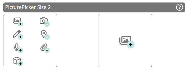
The data-win-option size: 2 is equivalent to the former size of the PicturePicker Control, three controls can be implemented in one row without layout problems.
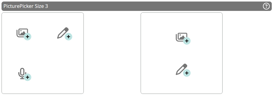
Use size: 3 to place two controls in one row and finally size: 4 to offer the largest PickerPicture Control, it uses the whole available space inside a block i.e. 460px width.
Picture Picker - "size: 1"

Picture Picker - "size: 1"
Picture Picker - "size: 2"

Picture Picker - "size: 2"
Picture Picker - "size: 3"

Picture Picker - "size: 3"
Picture Picker - "size: 4"

Picture Picker - "size: 4"
Labels for this element can be set extra Labels.